Select a language

EnglishGerman

Release Notes

Iteration 38Iteration 37Iteration 36Iteration 35Iteration 34Iteration 33Iteration 32Iteration 31Iteration 30Iteration 29Iteration 28Iteration 27Iteration 26Iteration 25Iteration 24Iteration 23Iteration 22Iteration 21

Iteration 38: 31 December - 20 January

The future is multi‑themed

This iteration marks the end of the frozen zone and the beginning of a new chapter: full Multi‑Theming is here. Every theme you explored in beta is now polished and ready to power any project with effortless switching and consistent styling.

A New Era of Theming

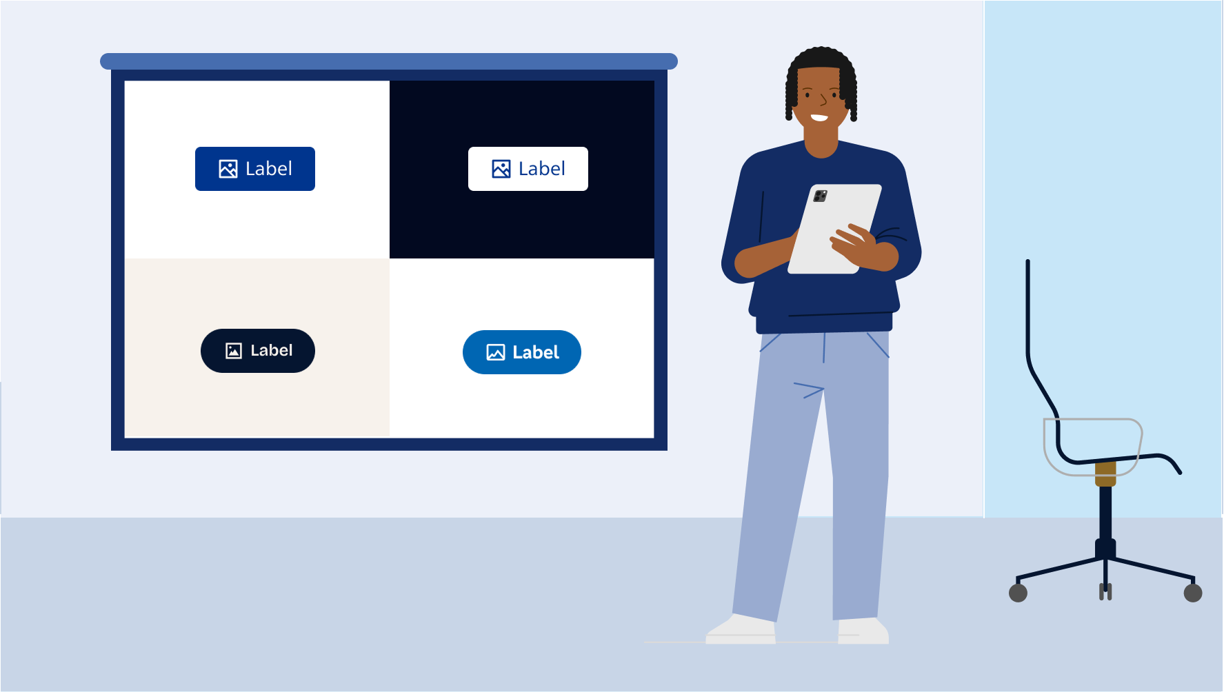
Multi‑Theming is now fully live across Storybook — refined, stable, and designed to give you complete creative and implementation freedom. The themes you’ve been exploring in beta have been expanded and polished into a seamless, production‑ready experience.

This update brings a unified styling foundation, driven by one stylesheet that adapts to your needs. Whether you’re building for brands, experimenting with new visuals, or evolving existing products, Multi‑Theming now gives you a true plug‑and‑play workflow with automatic theme sync across environments.

KidStarter and VB remain part of this ecosystem but are now password‑protected to keep them internal. Your teams can continue using them with added control and safety.

This milestone also introduces important breaking changes as we cleaned up structures, tokens, and behaviors to ensure long‑term consistency. Designers and developers should review their setups to make sure everything aligns with the renewed theming foundation. The new theming system is prepared for different environments (e.g., Tailwind CSS v4 or v3, SCSS, etc.). Please review the documentation and choose the setup that best fits your project and team before migrating.

And we’re not stopping here — Multi‑Theming will soon arrive in Figma as well. We’re currently applying the final adjustments to unlock the experience for designers, making sure theme switching becomes just as smooth in design as it already is in development.

Floating labels for form components

The waiting is over. If you’ve already had a smooth introduction to floating labels on sd-input, you can now use the same pattern across more form components. Try it out on sd-select, sd-datepicker, sd-combobox, and sd-textarea via the new floating-label attribute. Behind the scenes, we also refined placeholder and floating-label behavior in sd-input to make the overall experience more consistent and reliable.

Small fixes and improvements

This release also includes a set of under-the-hood refinements focused on visual consistency, theming stability, and better defaults across components. In practice, you should notice fewer styling edge cases, smoother theme behaviour, and more predictable rendering across different setups. In addition, sd-tag now supports slotted icon, making icon and label layouts easier and more consistent. And at last, we have a new header template in figma.

The Frozen Zone has melted

We’re excited to share that with the end of the “Frozen Zone”, Multi-Theming is not the only feature graduating to stable. Everything introduced over the last sprints in the next releases is now available in the stable Solid v6 line—ready to use in production.

Don’t forget to check the documentation and upgrade from your next version to the stable one.

What’s Next?

In the coming iterations, we’ll run an internal QA round on Multi‑Theming in development to ensure design and code stay perfectly aligned — among other improvements, this will be a quiet force that will slowly help us refine our multi-theming.

As always, your feedback will play a key role as we refine the experience. We also expect to publish a few component upgrades currently in progress, and of course, Figma Multi‑Theming is just around the corner.